---
engine: jupyter
jupyter: libro-clv
execute:
echo: true
warning: false
message: false
---
# Case study: Online Retail II {#sec-online-retail-case}
::: {.grid}
::: {.g-col-12 .g-col-md-4}
[{fig-alt="Cover of the book Customer Lifetime Value (CLV), by Manuel Delgado Tenorio" width="100%"}](https://www.amazon.es/dp/B0H7NC7P3H)
:::
::: {.g-col-12 .g-col-md-8}
This runnable notebook accompanies my book ***Customer Lifetime Value (CLV) — Why Some Customers Are Worth More Than Others***, now available in English (paperback and Kindle), as well as in [Spanish](https://www.manueldelgado.com/libro-clv/). If you're coming from the book, you already know why you're here. And if you landed here by chance, welcome all the same: this stands on its own, though I'll warn you that the book explains the why behind each step rather better than a code notebook can.
I'm [Manuel Delgado Tenorio](https://www.manueldelgado.com/): an advisor to companies on data and AI strategy applied to marketing, a lecturer, and a researcher, with CLV as my main line of academic work. On [my website](https://www.manueldelgado.com/) you'll find who I am, what I do, and a newsletter of irregular frequency but honest intent.
[Buy on Amazon (ES)](https://www.amazon.es/dp/B0H7NC7P3H){.btn .btn-primary .btn-sm} [Buy on Amazon (US)](https://www.amazon.com/dp/B0H7NC7P3H){.btn .btn-primary .btn-sm} [manueldelgado.com](https://www.manueldelgado.com/){.btn .btn-outline-primary .btn-sm}
:::
:::
**Direct downloads:**
- [The full case study, ready to run (.zip)](clv-case-study-online-retail.zip)
- [The retention curve and CLV Excel from chapter 4 (.xlsx)](https://www.manueldelgado.com/clv_resources/retention_curve_and_clv.xlsx)
- [The Tedelman case dataset, from chapters 9 to 11: parquets and decision card (.zip)](tedelman_dataset/tedelman_dataset.zip)
This case study is the **online appendix** of the book *Customer Lifetime Value (CLV) — Why Some Customers Are Worth More Than Others*: the working notebook, runnable end to end, that complements the narrative of chapters 5, 6, 7, and 8. I walk you through a public dataset (Online Retail II, from the UCI Machine Learning Repository) and, on top of it, run the full cycle of a serious CLV project: first, the retrospective look of chapter 5 (preliminary audit, cleaning decisions, monthly cohorts, and RFM); then the predictive side of chapter 6 (calibrating BG/NBD and Gamma-Gamma, *pAlive*, and expected value per customer); next, the honest validation of chapter 7; and, finally, the value-based segmentation that feeds chapter 8. Build, validate, and act, in that order. I close by persisting five artifacts that you'll load as-is in the following chapters, without touching anything again.
::: {.callout-note title="How this case study is designed (and how to run it on your machine)" appearance="simple"}
What matters in this case study isn't the code (which is here, and runnable), but the decisions. Each of the case's seven decisions (four on cleaning and three on modeling) appears in a fixed block with four fields: **decision, why, alternatives discarded, and visible consequences**. If in your real project you make other decisions, that's fine; what matters is that you make them deliberately, document them, and leave a defensible trail.
No need to copy the code cell by cell: [download the full case](clv-case-study-online-retail.zip), a ZIP with this notebook (`index.qmd`), the dependencies (`requirements.txt`), and a README with the instructions. You need Python 3.10 or higher and [Quarto](https://quarto.org/docs/get-started/); from there:
```bash
unzip clv-case-study-online-retail.zip && cd clv-case-study-online-retail
python3 -m venv .venv
source .venv/bin/activate
pip install -r requirements.txt
python -m ipykernel install --user --name libro-clv --display-name "Libro CLV"
quarto preview index.qmd
```
The first run takes a little longer, because it downloads the original `.xlsx` (about 45 MB) from UCI into `materials/ch05/raw/`; after that, it goes straight there. More of a notebooks person? `quarto convert index.qmd` turns it into an `.ipynb` you can open in Jupyter. Just want to read the code at your own pace? The `</> Code` menu at the top right shows you this page's full source without downloading anything.
:::
{fig-alt="The Customer Lifetime Value (CLV) book, in paperback, at an airport boarding gate" .rounded}
```{python}
#| label: setup
#| include: false
import hashlib
import io
import zipfile
from pathlib import Path
from urllib.request import urlopen
import matplotlib as mpl
import matplotlib.pyplot as plt
import numpy as np
import pandas as pd
from IPython.display import Markdown, display
from matplotlib.colors import BoundaryNorm, ListedColormap
# Paths relative to the Quarto project root (caso-practico/en/), not the book's.
# This means the case is rendered with `quarto render .` from caso-practico/en/,
# not from the repo root.
BASE = Path("materials/ch05")
RAW_DIR = BASE / "raw"
OUT_DIR = BASE / "outputs"
RAW_FILE = RAW_DIR / "online_retail_II.xlsx"
UCI_URL = "https://archive.ics.uci.edu/static/public/502/online+retail+ii.zip"
RAW_DIR.mkdir(parents=True, exist_ok=True)
OUT_DIR.mkdir(parents=True, exist_ok=True)
# Book's visual style: typography and grayscale (max. 4 levels, min. 20% darkness)
mpl.rcParams["font.family"] = "sans-serif"
mpl.rcParams["font.sans-serif"] = ["Avenir Next Condensed", "Helvetica", "Arial", "DejaVu Sans"]
mpl.rcParams["axes.titlesize"] = 11
mpl.rcParams["axes.labelsize"] = 9
mpl.rcParams["xtick.labelsize"] = 8
mpl.rcParams["ytick.labelsize"] = 8
mpl.rcParams["axes.spines.top"] = False
mpl.rcParams["axes.spines.right"] = False
GRAYS_4 = ["#cccccc", "#969696", "#525252", "#252525"]
CMAP_GRAYS = ListedColormap(GRAYS_4)
pd.set_option("display.max_columns", 12)
pd.set_option("display.width", 140)
def download_if_missing(dest: Path = RAW_FILE, url: str = UCI_URL) -> Path:
"""Download online_retail_II.xlsx from UCI if it isn't already on disk."""
if dest.exists():
return dest
print(f"Downloading {url} (~45 MB)...")
try:
with urlopen(url, timeout=120) as r:
data = r.read()
except Exception as e:
raise RuntimeError(
"I couldn't download the dataset from UCI. "
"If you're offline or the server is down, manually download "
f"the .xlsx from {url} and place it at {dest}. "
f"Original error: {e}"
) from e
with zipfile.ZipFile(io.BytesIO(data)) as z:
name = next(n for n in z.namelist() if n.endswith(".xlsx"))
with z.open(name) as src, open(dest, "wb") as dst:
dst.write(src.read())
print(f"Saved to {dest}")
return dest
```
## Loading and orientation
The dataset you'll use (Online Retail II, hosted in the UCI ML Repository under id 502) contains about 1,067,000 order lines from a British online retailer between December 2009 and December 2011. The company sells gifts and homeware, half to end consumers, half to small wholesalers. There's no contract, no subscription, nothing resembling a "cancellation date": when a customer stops buying, they simply disappear. That makes it the textbook example of a **deliberately noncontractual** business, as I told you back in chapter 5.
```{python}
#| label: descarga-y-carga
path = download_if_missing()

# The xlsx has two sheets (one year per sheet). I load both and concatenate them.
sheets = pd.read_excel(path, sheet_name=None, engine="openpyxl")
print(f"Sheets in the xlsx: {list(sheets.keys())}")

df = pd.concat(
    [s.assign(_sheet=name) for name, s in sheets.items()],
    ignore_index=True,
)

# I rename to snake_case to work more comfortably internally. The xlsx's
# original columns are still the UCI ones; if you want to keep that naming,
# change this block and you're done.
df = df.rename(columns={
    "Invoice": "invoice",
    "StockCode": "stockcode",
    "Description": "description",
    "Quantity": "quantity",
    "InvoiceDate": "invoice_date",
    "Price": "price",
    "Customer ID": "customer_id",
    "Country": "country",
})

df["invoice"] = df["invoice"].astype(str)
df["stockcode"] = df["stockcode"].astype(str)
df["invoice_date"] = pd.to_datetime(df["invoice_date"])
df["amount"] = df["quantity"] * df["price"]

print(f"Shape: {df.shape}")
print(f"Time range: {df['invoice_date'].min()} -> {df['invoice_date'].max()}")
df.head(3)
```
The columns are what you'd expect: invoice identifier, product code and description, quantity, invoice date with timestamp, unit price, customer identifier, and country. The `amount` I add for convenience is simply `quantity × price` (negative if the line is a cancellation, which we'll see shortly).
## Preliminary audit {#sec-preliminary-audit}
Before modeling anything, you have to audit. I said it in ch. 5 and I'll repeat it here: if you model on dirty data, what comes out of the model confirms what the model "sees," and if what it sees is noise, it confirms noise with an extra decimal. Let's start by counting.
```{python}
#| label: volumes
volumes = pd.Series({
    "Total lines": len(df),
    "Unique invoices": df["invoice"].nunique(),
    "Unique customers (with ID)": int(df["customer_id"].dropna().nunique()),
    "Unique products (stockcodes)": df["stockcode"].nunique(),
    "Distinct countries": df["country"].nunique(),
    "Rows without Customer ID": int(df["customer_id"].isna().sum()),
    "Rows with cancellation-type Invoice": int(df["invoice"].str.startswith("C").sum()),
})
volumes
```
```{python}
#| label: percentages
percentages = pd.Series({
    "Rows without Customer ID (%)": df["customer_id"].isna().mean() * 100,
    "Cancellation rows (%)": df["invoice"].str.startswith("C").mean() * 100,
})
percentages.round(2)
```
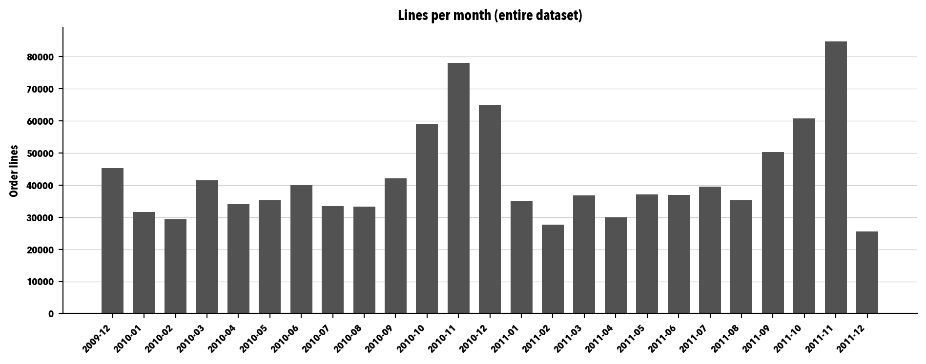
Two figures should catch your eye. The first, that **one in four lines has no `Customer ID`**. That's a lot: if you ignore it and drag those rows into a customer-level analysis, you contaminate everything. The second, that there's a small but not negligible percentage of rows that are cancellations (the retailer's convention is to prefix the `Invoice` with the letter `C`). Each of those two pathologies needs its own decision, and I devote [section -@sec-cleaning-decisions] to them.
```{python}
#| label: fig-calendar
#| fig-cap: "Monthly distribution of the number of order lines. The October–November peak is the footprint of the wholesaler gearing up for Christmas; the late-January trough is the hangover from that same season."
monthly = (df.assign(month=df["invoice_date"].dt.to_period("M"))
             .groupby("month")
             .size())

fig, ax = plt.subplots(figsize=(10, 4))
ax.bar(range(len(monthly)), monthly.values, color=GRAYS_4[2], width=0.7)
ax.set_xticks(range(len(monthly)))
ax.set_xticklabels([str(m) for m in monthly.index], rotation=45, ha="right")
ax.set_ylabel("Order lines")
ax.set_title("Lines per month (entire dataset)")
ax.grid(axis="y", color=GRAYS_4[0], linestyle="-", linewidth=0.5)
ax.set_axisbelow(True)
plt.tight_layout()
plt.show()
```
```{python}
#| label: basket-stockcodes
# Distribution of lines per invoice
lines_per_invoice = df.groupby("invoice").size()
print("Lines per invoice:")
print(f"  median = {lines_per_invoice.median():.0f}")
print(f"  mean   = {lines_per_invoice.mean():.1f}")
print(f"  p95    = {lines_per_invoice.quantile(0.95):.0f}")

# Top countries
print("\nTop 5 countries (% of lines):")
print((df["country"].value_counts(normalize=True).head(5) * 100).round(2))

# "Odd" stockcodes (the ones that aren't products)
odd_pattern = r"^(POST|BANK CHARGES|AMAZON FEE|DOT|M|S|ADJUST|PADS|CRUK|TEST)$"
odd_mask = df["stockcode"].astype(str).str.match(odd_pattern, na=False)
print(f"\nLines with 'odd' stockcode (not a product): {odd_mask.sum():,} "
      f"({odd_mask.mean()*100:.3f}% of total)")
print("\nTop odd stockcodes:")
print(df.loc[odd_mask, "stockcode"].value_counts().head(10))
```
The odd `stockcodes` are entries that **aren't products**: shipping charges (`POST`), bank fees (`BANK CHARGES`), Amazon fees (`AMAZON FEE`), a mysterious single-character category (`M`, `S`, `D`...), manual adjustments (`ADJUST`, `Manual`), and the like. They show up as lines on invoices mixed in with real product. For this first pass I'll leave them in, because their contribution to revenue is marginal and their effect on RFM is small. In a real project, it's worth auditing them one by one; I'll note it and move on.
## The four cleaning decisions {#sec-cleaning-decisions}
We reach the heart of the case study. Let me remind you of the leitmotiv I repeat throughout the book: **decide, document the decision, and leave a defensible trail**. Each of the four decisions you'll see below is made deliberately, and in each case I show you what would happen had I chosen any of the alternatives. If your real project needs a different decision, repeat the exercise: four fields, no gaps.
### Null customer identifiers
About one in four lines in the dataset has no `Customer ID`. That's a lot. Before going any further, you have to decide what to do with those rows.
::: {.callout-important title="Decision 1: rows without Customer ID" appearance="simple"}
**Decision.** Rows without a `Customer ID` are kept in the preliminary audit (volumes, calendar, countries, basket) but excluded from any customer-level analysis: cohorts, RFM, and the chapter 6 models.
**Why.** Aggregate information about the business's activity (how much it sells, when, where, what) is still valid with all the rows. Customer-level information, by definition, can't be built without an identifier. Mixing the two (assigning a common ID to all the nulls, for example) introduces an eternal, compulsive-buying "unknown customer" that contaminates any retention statistic.
**Alternatives discarded.** Excluding the rows from the very first step (you lose useful aggregate context) and treating the nulls as a single unknown customer (contaminates RFM and cohorts). Neither is defensible.
**Visible consequences.** The next block shows you how many lines and how much revenue drop out of the customer analysis when this decision is applied.
:::
```{python}
#| label: decision-1-figures
null_rows = df["customer_id"].isna().sum()
null_revenue = df.loc[df["customer_id"].isna(), "amount"].sum()
total_revenue = df["amount"].sum()

print(f"Lines dropped from the customer analysis: {null_rows:,} "
      f"({null_rows/len(df)*100:.2f}%)")
print(f"Revenue associated with those lines:      {null_revenue:,.2f} "
      f"({null_revenue/total_revenue*100:.2f}% of total)")

df_customer = df.dropna(subset=["customer_id"]).copy()
df_customer["customer_id"] = df_customer["customer_id"].astype(int)
print(f"\nResulting df_customer table: {df_customer.shape}")
```
### Cancellations
Cancellations are recognized because their `invoice` starts with the letter `C` and their `quantity` is negative.
::: {.callout-important title="Decision 2: cancellations" appearance="simple"}
**Decision.** Cancellations are kept as separate rows with negative `quantity` and `amount`. The net only comes out when you aggregate by customer or by period. No attempt is made to match them with the original sale.
**Why.** It's the most transparent, simplest, and most defensible option. The cancellation leaves a mark on the calendar (it's part of the customer's activity with the business) and the aggregate net correctly reflects the customer's value. Cancellation-to-sale matching is imperfect (a fraction find no exact match by the same `stockcode` and `customer_id`), adds heuristics, and yields little additional precision over the simple option.
**Alternatives discarded.** Matching with the original sale and subtracting (disproportionate work for marginal precision) and discarding all cancellations (artificially inflates revenue).
**Visible consequences.** In the next block I count the cancellation lines, compute the "gross" revenue (positive only) against the net (with cancellations included), and show how much the total loses to returns.
:::
```{python}
#| label: decision-2-figures
df_customer["is_cancellation"] = df_customer["invoice"].str.startswith("C")
n_cancellations = df_customer["is_cancellation"].sum()
negative_revenue = df_customer.loc[df_customer["is_cancellation"], "amount"].sum()
gross_revenue = df_customer.loc[~df_customer["is_cancellation"], "amount"].sum()
net_revenue = df_customer["amount"].sum()

print(f"Cancellation lines: {n_cancellations:,} "
      f"({n_cancellations/len(df_customer)*100:.2f}% of rows with ID)")
print(f"Gross revenue (positive only): {gross_revenue:,.2f}")
print(f"Net revenue (with cancellations): {net_revenue:,.2f}")
print(f"Reduction from cancellations:  {-negative_revenue:,.2f} "
      f"({-negative_revenue/gross_revenue*100:.2f}% of gross)")
```
### Observation window for RFM
The dataset covers two years. For RFM you have to choose a window.
::: {.callout-important title="Decision 3: observation window for RFM" appearance="simple"}
**Decision.** RFM is computed over the last 12 months of the dataset, a window closing on 2011-12-09 (the last day with complete data). The cohort computation ([section -@sec-cohorts]) and the chapter 6 models still use all the available history.
**Why.** Twelve months are a full seasonal cycle (it includes the October–November peak, which in this business is very relevant), it fits the convention you'll see in any marketing-automation tool, and it leaves out the dataset's first truncated month. It's the reasonable default choice.
**Alternatives discarded.** Using the whole dataset (mixes very different cohorts and folds the truncation into the computation) and a six-month window (too short for a business with a wholesale cadence of two or three months; high risk of labeling as "Lost" customers who are in their natural cycle).
**Visible consequences.** The next block shows you how many customers have at least one purchase within the window and how many fall outside it (customers with early purchases who are already inactive).
:::
```{python}
#| label: decision-3-figures
CUTOFF_DATE = pd.Timestamp("2011-12-09")
WINDOW_START = CUTOFF_DATE - pd.Timedelta(days=365)

window_mask = (
    (df_customer["invoice_date"] >= WINDOW_START) &
    (df_customer["invoice_date"] <= CUTOFF_DATE + pd.Timedelta(days=1))
)
df_window = df_customer[window_mask].copy()

customers_in_window = df_window["customer_id"].nunique()
total_customers = df_customer["customer_id"].nunique()

print(f"RFM window: {WINDOW_START.date()} -> {CUTOFF_DATE.date()}")
print(f"Customers with at least one purchase in window: {customers_in_window:,} "
      f"of {total_customers:,} ({customers_in_window/total_customers*100:.1f}%)")
print(f"Customers outside the window (only count for cohorts): "
      f"{total_customers - customers_in_window:,}")
```
### Defining *monetary value*
Monetary has several reasonable meanings. Here I give you the one consistent with decision 2 on cancellations.
::: {.callout-important title="Decision 4: how to compute monetary value" appearance="simple"}
**Decision.** The *monetary value* is the net sum of `quantity × price` per customer within the window, including cancellations with their negative sign. No estimated margin is applied.
**Why.** It's consistent with decision 2: if cancellations stay as negative rows, the "clean" monetary is the net. Besides, it introduces no additional assumption about margin, which keeps the case study held up by the raw data (and not by a made-up figure). In chapter 6 I do discuss the step from revenue to margin, but as an explicit caveat.
**Alternatives discarded.** Estimated margin with an assumed variable cost (pedagogically interesting but introduces a made-up figure that carries into chs. 6 and 7) and gross amount without subtracting cancellations (inconsistent with decision 2).
**Visible consequences.** Some customers with large cancellations end up with a very low `monetary` or, in extreme cases, a negative one. The next block counts how many.
:::
```{python}
#| label: decision-4-figures
# The monetary computation happens further down, in the RFM section, but you can already look at
# the aggregate effect: net total per customer and how many end up with M <= 0.
m_per_customer = df_window.groupby("customer_id")["amount"].sum()
print(f"Customers with monetary <= 0: {(m_per_customer <= 0).sum():,}")
print(f"Customers with monetary  < 0: {(m_per_customer <  0).sum():,}")
print(f"Mean monetary:    {m_per_customer.mean():,.2f}")
print(f"Median monetary:  {m_per_customer.median():,.2f}")
```
## Consolidated transaction table
After the four decisions, you have a clean and traceable transaction table. This is the base on which the cohorts ([-@sec-cohorts]) and the RFM ([-@sec-rfm]) are built.
```{python}
#| label: consolidated-table
clean_transactions = (df_customer[[
        "customer_id", "invoice", "invoice_date", "stockcode", "description",
        "quantity", "price", "amount", "is_cancellation", "country"
    ]]
    .sort_values(["customer_id", "invoice_date"])
    .reset_index(drop=True))

print(f"Shape: {clean_transactions.shape}")
print(f"Unique customers: {clean_transactions['customer_id'].nunique():,}")
print(f"Aggregate net revenue: {clean_transactions['amount'].sum():,.2f}")
clean_transactions.head(5)
```
## Monthly cohorts {#sec-cohorts}
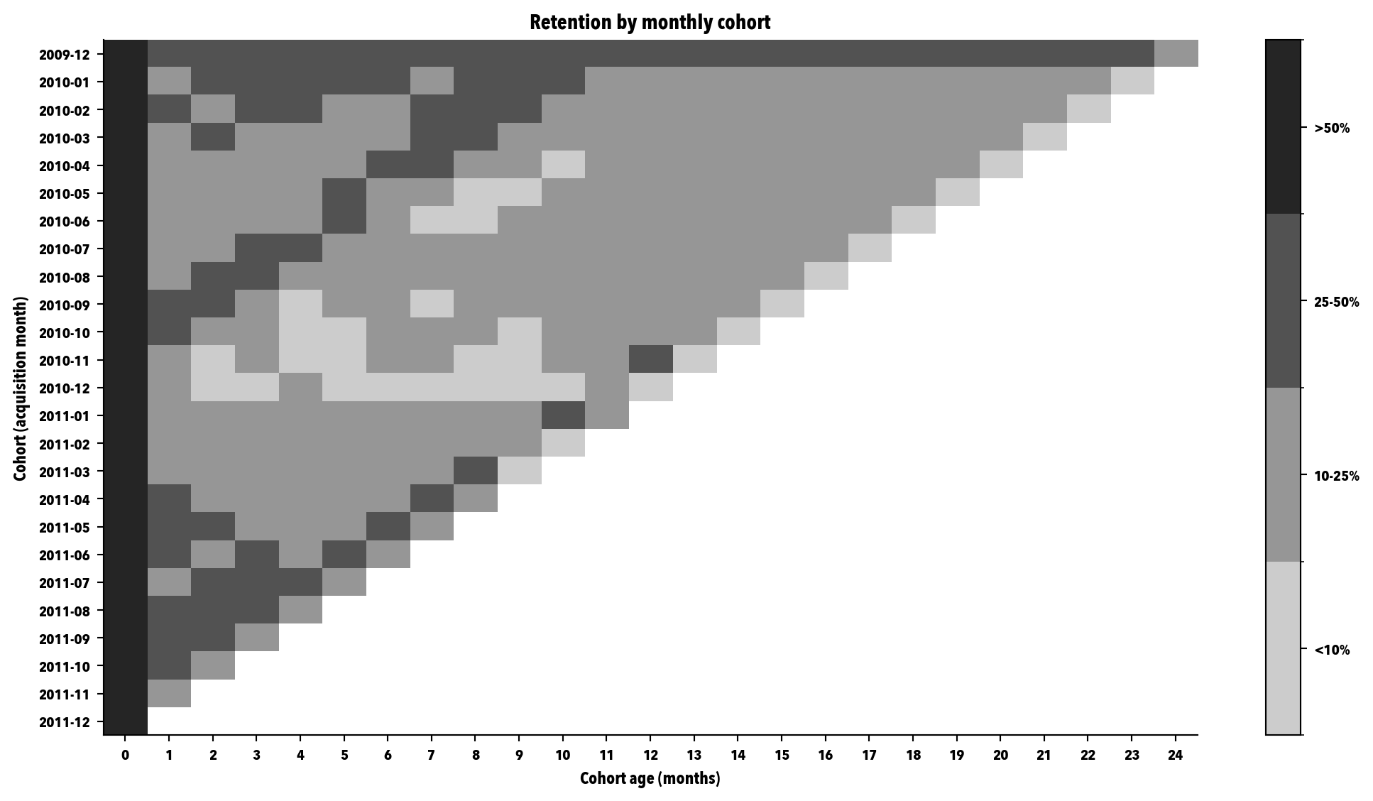
A cohort is a group of customers acquired in the same month. The question you answer with cohorts is: what fraction of each cohort is still active after N months? The answer, tabulated and drawn as a heatmap, tells you a lot about your base's retention structure.
I build the retention matrix in two steps. First, I assign each customer their cohort (the month of their first purchase). Then, for each cohort-age combination, I count how many unique customers have any purchase in that month.
```{python}
#| label: cohort-matrix
t = clean_transactions.copy()
t["period"] = t["invoice_date"].dt.to_period("M")
first_purchase = t.groupby("customer_id")["period"].min().rename("cohort")
t = t.merge(first_purchase, on="customer_id")
t["age"] = (t["period"] - t["cohort"]).apply(lambda x: x.n)

active = (t.groupby(["cohort", "age"])["customer_id"]
            .nunique()
            .unstack(fill_value=0))
cohort_size = active[0]
retention = active.div(cohort_size, axis=0)

print(f"Cohorts (rows): {len(retention)}")
print(f"Observed ages (columns): {retention.shape[1]}")
print("\nFirst 5 cohorts x 6 ages:")
print(retention.iloc[:5, :6].round(3))
```
```{python}
#| label: fig-cohort-heatmap-real
#| fig-cap: "Retention heatmap by monthly cohort on Online Retail II. Each row is the acquisition cohort, each column is the age in months. The intensity encodes the fraction of the cohort still active: light gray for low percentages (<10%), dark gray for high retention (>50%). Empty cells correspond to periods not yet observed."
fig, ax = plt.subplots(figsize=(11, 6))

# Boundaries for the 4-level scale
boundaries = [0.0001, 0.10, 0.25, 0.50, 1.01]
norm = BoundaryNorm(boundaries, CMAP_GRAYS.N)

# NaN for unobserved cells
masked = retention.where(retention > 0, np.nan)
im = ax.imshow(masked.values, aspect="auto", cmap=CMAP_GRAYS, norm=norm)

ax.set_yticks(range(len(retention)))
ax.set_yticklabels([str(c) for c in retention.index])
ax.set_xticks(range(retention.shape[1]))
ax.set_xticklabels([str(c) for c in retention.columns])
ax.set_xlabel("Cohort age (months)")
ax.set_ylabel("Cohort (acquisition month)")
ax.set_title("Retention by monthly cohort")

cbar = fig.colorbar(im, ax=ax, ticks=[0.05, 0.175, 0.375, 0.755])
cbar.ax.set_yticklabels(["<10%", "10-25%", "25-50%", ">50%"])
plt.tight_layout()
plt.show()
```
Three things worth reading in this map, and that you generally look at in any cohort heatmap:
First, the **shape of the retention curve**. Column 0 is at 100% by construction (every cohort is alive the month you capture it). Column 1 shows you how much drops off in the first month, which in any mature noncontractual base is always a steep drop. After that, the rate of decline eases. That shape isn't accidental: it's the footprint of your base's heterogeneity, which I formalize in chapter 6.
Second, the **cohort-to-cohort stability**. The bottom rows are the new cohorts, the top ones the old. If the bottom rows "go dark" sooner than the top ones, something has changed: product, acquisition channel, competition. In this dataset, look at whether the 2011 cohorts age differently from the 2010 ones.
Third, the **unexplained steps**. If an entire column of the heatmap shows an anomalous drop (every cohort loses a lot of customers at the same age), it usually points to an exogenous event: a price increase, a policy change, a technical incident. If you find one, don't ignore it; it's operational information valuable in its own right.
## RFM {#sec-rfm}
A reminder from chapter 5: RFM is retrospective by construction. The three variables summarize the customer's observed behavior; none of them says anything about the future. Here I build the RFM over the 12-month window defined in decision 3.
```{python}
#| label: rfm-computation
rfm = (df_window.groupby("customer_id")
       .agg(recency_days=("invoice_date", lambda x: (CUTOFF_DATE - x.max()).days),
            frequency=("invoice", "nunique"),
            monetary=("amount", "sum"))
       .reset_index())

print(f"Customers in the RFM: {len(rfm):,}")
print(f"\nRecency (days since last purchase):")
print(f"  mean={rfm['recency_days'].mean():.1f}, median={rfm['recency_days'].median():.0f}, "
      f"p90={rfm['recency_days'].quantile(0.9):.0f}")
print(f"\nFrequency (number of unique invoices in window):")
print(f"  mean={rfm['frequency'].mean():.2f}, median={rfm['frequency'].median():.0f}, "
      f"p90={rfm['frequency'].quantile(0.9):.0f}")
print(f"\nMonetary (net amount in window):")
print(f"  mean={rfm['monetary'].mean():.2f}, median={rfm['monetary'].median():.2f}, "
      f"p90={rfm['monetary'].quantile(0.9):.2f}")

rfm.head()
```
Next, the quintile scoring. For Recency, the highest quintile (5) corresponds to the most recent customer; for Frequency and Monetary, the highest to the one who buys the most. I use `pd.qcut` with `rank(method="first")` to avoid ties problems: in datasets with many customers who buy exactly once, the "clean" quintiles can collapse.
```{python}
#| label: rfm-scoring
def quintile(series: pd.Series, ascending: bool = True) -> pd.Series:
    """Quintile 1-5. If ascending=True, high value -> high score."""
    ranked = series.rank(method="first", ascending=ascending)
    return pd.qcut(ranked, 5, labels=[1, 2, 3, 4, 5]).astype(int)

# For Recency: more recent = lower recency_days = higher score
rfm["R"] = quintile(rfm["recency_days"], ascending=False)
rfm["F"] = quintile(rfm["frequency"], ascending=True)
rfm["M"] = quintile(rfm["monetary"], ascending=True)

def assign_segment(row: pd.Series) -> str:
    R, F, M = row["R"], row["F"], row["M"]
    if R >= 4 and F >= 4 and M >= 4:
        return "Champions"
    if F >= 4 and M >= 4 and R == 3:
        return "Loyal Customers"
    if R >= 4 and F <= 3 and F >= 2:
        return "Potential Loyalists"
    if R >= 4 and F == 1:
        return "New Customers"
    if R <= 2 and F >= 4 and M >= 4:
        return "Can't Lose Them"
    if R <= 2 and F >= 3:
        return "At Risk"
    if R <= 2 and F <= 2 and M <= 2:
        return "Lost"
    return "Hibernating"

rfm["segment"] = rfm.apply(assign_segment, axis=1)
rfm[["customer_id", "recency_days", "frequency", "monetary", "R", "F", "M", "segment"]].head(10)
```
```{python}
#| label: segment-distribution
dist = (rfm.groupby("segment")
        .agg(n_customers=("customer_id", "size"),
             net_revenue=("monetary", "sum"))
        .assign(pct_customers=lambda d: d["n_customers"] / d["n_customers"].sum() * 100,
                pct_revenue=lambda d: d["net_revenue"] / d["net_revenue"].sum() * 100)
        .sort_values("n_customers", ascending=False)
        .round(2))
dist
```
Look at the concentration. In any real noncontractual base, the top segments (Champions, Loyal Customers, Can't Lose Them) concentrate a fraction of revenue far above their fraction of customers; the Hibernating and Lost are a huge proportion of customers but a much smaller contribution to revenue. That asymmetry isn't a defect: it's the typical structure of a customer base, and it's exactly why any marketing decision needs segmentation.
### The "eternal Champion": empirical diagnosis
I reminded you in chapter 5 that the "Champion" label is retrospective and, therefore, can contain customers who left long ago but whom the twelve-month window still counts. I'm going to look for them empirically: within the Champions segment, I compute the **maximum gap between two consecutive purchases within the window** and flag as suspects the ones whose gap is well above the median. The intuition: a genuine Champion has a regular purchase pattern, without long gaps. An "eternal Champion" has purchases concentrated at the start of the window and a hole toward the end.
```{python}
#| label: eternal-champion
champions_ids = rfm.loc[rfm["segment"] == "Champions", "customer_id"].tolist()
trans_champions = (df_window[df_window["customer_id"].isin(champions_ids)]
                   .sort_values(["customer_id", "invoice_date"]))


def max_gap_days(g: pd.DataFrame) -> float:
    if len(g) < 2:
        return np.nan
    diffs = g["invoice_date"].diff().dt.days.dropna()
    return float(diffs.max()) if len(diffs) else np.nan


gaps = (trans_champions.groupby("customer_id")[["invoice_date"]]
        .apply(max_gap_days)
        .reset_index(name="gap_max_days")
        .dropna())

median_gap = gaps["gap_max_days"].median()
threshold = max(median_gap * 3, 60)  # minimum 60 days to avoid absurd thresholds
suspects = gaps[gaps["gap_max_days"] > threshold]

print(f"Total Champions: {len(champions_ids):,}")
print(f"Median of the maximum gap between purchases (in days): {median_gap:.1f}")
print(f"'Suspicious' threshold (3 x median, minimum 60 days): {threshold:.0f}")
print(f"Champions suspected of being 'eternal': {len(suspects):,} "
      f"({len(suspects)/max(len(champions_ids),1)*100:.1f}% of the segment)")
```
If the number of suspects is small, congratulations, your noncontractual base has reasonably active Champions; the retrospective labeling is telling you a story consistent with reality. If the number is large, you have a classic RFM problem: you're holding on to labels that reality has already disproven. The fix isn't to adjust the RFM (it's still retrospective), it's to complement it with the probabilistic models of chapter 6, which estimate `pAlive` and let you see in time which Champions have stopped being Champions.
## Persistence {#sec-persistence}
The case's retrospective part ends here, but the tables it produces are the input of chs. 6 and 7. I leave them in `materials/ch05/outputs/` in parquet format (fast to load, preserves types, takes little space). I add a small dataset card (`CARD.md`) that documents the four decisions so that ch. 6 can cite it without recomputing anything.
```{python}
#| label: persistence
clean_transactions.to_parquet(OUT_DIR / "clean_transactions.parquet", index=False)
retention.reset_index().to_parquet(OUT_DIR / "cohort_matrix.parquet", index=False)
rfm.to_parquet(OUT_DIR / "rfm_table.parquet", index=False)

# Hash of the source for traceability
h = hashlib.sha256()
with open(RAW_FILE, "rb") as f:
    for block in iter(lambda: f.read(8192), b""):
        h.update(block)
hash_xlsx = h.hexdigest()[:16]

card = f"""# Processed dataset card

**Generated:** {pd.Timestamp.now().strftime('%Y-%m-%d %H:%M:%S')}
**Source:** Online Retail II (UCI ML Repository, id=502)
**sha256[:16] hash of the raw .xlsx:** `{hash_xlsx}`

## Aggregate figures

- Total lines (with nulls): {len(df):,}
- Lines with Customer ID: {len(df_customer):,}
- Unique customers (with ID): {df_customer['customer_id'].nunique():,}
- Unique invoices (with ID): {df_customer['invoice'].nunique():,}
- Time range: {df['invoice_date'].min().date()} to {df['invoice_date'].max().date()}
- Total net revenue: {df_customer['amount'].sum():,.2f}
- Cancellations: {int(df_customer['is_cancellation'].sum()):,} lines

## Decisions made in the case study

1. **Null Customer ID:** excluded for customer analysis, kept in the preliminary audit.
2. **Cancellations:** kept as separate rows with negative `Quantity` and amount.
3. **RFM window:** 12 months closing 2011-12-09.
4. **Monetary value:** net amount = sum(quantity * price), includes cancellations with their sign.

## Persisted artifacts

- `clean_transactions.parquet`: transaction table with ID, feeds chs. 6 and 7.
- `cohort_matrix.parquet`: cohort x age matrix with retention fraction.
- `rfm_table.parquet`: one row per customer with R, F, M, scores, and canonical segment.
"""

(OUT_DIR / "CARD.md").write_text(card, encoding="utf-8")

print("Artifacts persisted in materials/ch05/outputs/:")
for f in sorted(OUT_DIR.iterdir()):
    print(f"  {f.name:35s}  {f.stat().st_size/1024:>8.1f} KB")
```
## From the retrospective to the predictive
Up to here, you've done what any serious CLV project asks for in its first phase: audit the base, make four cleaning decisions, look at cohorts, and build the RFM. The three tables you persisted in [-@sec-persistence] are the case's retrospective floor.
What comes next is the predictive side of chapter 6 and the validation of chapter 7, in the order any defensible analysis demands: build, validate, and, only if it passes validation, act. In [-@sec-predictive-modeling] you'll calibrate BG/NBD and Gamma-Gamma on the clean transactions, generate per-customer predictions (pAlive, expected number of purchases, forward-looking expected value at 12 months), and pick back up the "eternal Champion" case to see what the model says. In [-@sec-validation] you'll put that model through the chapter 7 validation battery: temporal holdout, aggregate predictions, calibration plot, decile analysis, lift over RFM and, finally, the top-100 business exercise. And, only if the model comes out well, in [-@sec-value-segments] you'll give it managerial shape: value quintiles, projections over several horizons, and two discount rates in parallel, to answer the question any leadership wants to hear ("how much is each segment of my base worth, and for how long?").
The new decisions, also with their fixed block of **decision / why / alternatives / visible consequences**, are three: the calibration/holdout temporal cutoff, what to do with cancellations for the fit, and which model family you choose for this case.
## Predictive modeling: BG/NBD and Gamma-Gamma {#sec-predictive-modeling}
### Decision 5: calibration/holdout temporal cutoff {#sec-calibration-cutoff}
::: {.callout-note title="Decision 5: calibration / holdout cutoff" appearance="simple"}
**Decision.** Cutoff on June 1, 2011: 18 months of calibration (2009-12-01 to 2011-05-31) and a little over 6 months of holdout (2011-06-01 to 2011-12-09).
**Why.** I want a holdout that covers at least a couple of full Christmas months (the wholesaler's footprint we already discussed in [-@sec-preliminary-audit]), because without them the validation leaves out the base's most distinctive behavior.
**Alternatives discarded.** A blind 80/20 cutoff on duration (leaves the holdout in the middle of the low season and puts the 2010 Christmas in calibration but the 2011 one outside). A 70/30 cutoff (leaves calibration too short for low-frequency customers).
**Visible consequences.** Any customer who appears for the first time after June 1, 2011 doesn't enter the model; we pick them back up in [-@sec-new-customers] when we discuss how to act on the analysis for new customers in general.
:::
```{python}
#| label: setup-A9
import warnings

warnings.filterwarnings("ignore")  # lifetimes raises some scipy FutureWarnings

# We load the artifacts from the persistence section
transactions = pd.read_parquet(OUT_DIR / "clean_transactions.parquet")
rfm = pd.read_parquet(OUT_DIR / "rfm_table.parquet")

# Ensure types
transactions["invoice_date"] = pd.to_datetime(transactions["invoice_date"])
transactions["customer_id"] = transactions["customer_id"].astype(str)
rfm["customer_id"] = rfm["customer_id"].astype(str)

# Temporal cutoff
cal_cutoff_date = pd.Timestamp("2011-06-01")
obs_end_date = transactions["invoice_date"].max()

print(f"History start:        {transactions['invoice_date'].min().date()}")
print(f"Calibration close:    {cal_cutoff_date.date()}")
print(f"Observation end:      {obs_end_date.date()}")
print(f"Calibration duration: {(cal_cutoff_date - transactions['invoice_date'].min()).days} days")
print(f"Holdout duration:     {(obs_end_date - cal_cutoff_date).days} days")
```
### Decision 6: cancellations in the fit
::: {.callout-note title="Decision 6: cancellations in the fit" appearance="simple"}
**Decision.** Filter out cancellations (negative amount) before calibrating BG/NBD. For Gamma-Gamma I use the mean net `monetary_value`, computed over the positive transactions only.
**Why.** BG/NBD models a repeat-purchase process; a cancellation isn't a new purchase, it's the voiding of a previous one. If I leave it in, I overestimate frequency.
**Alternatives discarded.** Matching cancellations with the original sale and working with net baskets (high risk of matching errors in this dataset, where IDs aren't consistent on cancellations). Keeping them with their sign (breaks BG/NBD's nonnegative count-process assumption).
**Visible consequences.** I lose about 18,700 lines (~2.3%) in the fit. The loss is uniform across high- and low-frequency customers, so it introduces no systematic bias.
:::
```{python}
#| label: positive-transactions
# We filter for the fit
trans_pos = transactions[transactions["amount"] > 0].copy()

print(f"Total transactions:            {len(transactions):,}")
print(f"Positive transactions:         {len(trans_pos):,}")
print(f"Excluded cancellations:        {(transactions['amount'] <= 0).sum():,}")
print(f"Customers with any positive:   {trans_pos['customer_id'].nunique():,}")
```
### Building the *summary* and *holdout*
```{python}
#| label: cal-hold
from lifetimes.utils import calibration_and_holdout_data

cal_hold = calibration_and_holdout_data(
    trans_pos,
    customer_id_col="customer_id",
    datetime_col="invoice_date",
    monetary_value_col="amount",
    calibration_period_end=cal_cutoff_date,
    observation_period_end=obs_end_date,
    freq="D"
)

print(f"Customers in calibration/holdout summary: {len(cal_hold):,}")
print(f"Mean frequency (calibration):             {cal_hold['frequency_cal'].mean():.2f}")
print(f"Mean recency (days):                      {cal_hold['recency_cal'].mean():.1f}")
print(f"Mean age T (days):                        {cal_hold['T_cal'].mean():.1f}")
print(f"Average order value (calibration):        {cal_hold['monetary_value_cal'].mean():.2f}")
```
### Decision 7: BG/NBD as the main model
::: {.callout-note title="Decision 7: BG/NBD as the main model (with Pareto/NBD as a control)" appearance="simple"}
**Decision.** I calibrate BG/NBD as the main model. Pareto/NBD enters only as a diagnostic control at the end.
**Why.** The case is noncontractual (ch. 5). The mean purchase frequency is reasonably high (>3 purchases in calibration for active customers), the pattern is stable month to month (except for the expected Christmas), and BG/NBD has better numerical stability and speed. It's the literature's standard choice for this kind of retailer.
**Alternatives discarded.** Pareto/NBD only (slower with no significant gain here). An ML model (adds no value for data of this size and horizon; it could add value if we had additional features like preferred category, channel, or web sessions).
**Visible consequences.** The fit runs in seconds. I'll verify in [-@sec-validation] that the calibration is defensible before using the model for anything else.
:::
### Pre-Gamma-Gamma diagnostic: frequency–AOV correlation
```{python}
#| label: corr-freq-aov
# Gamma-Gamma requires independence between frequency and average order value
gg_check = cal_hold[(cal_hold["frequency_cal"] > 0) & (cal_hold["monetary_value_cal"] > 0)].copy()
corr_pearson = gg_check["frequency_cal"].corr(gg_check["monetary_value_cal"])
corr_spearman = gg_check["frequency_cal"].corr(gg_check["monetary_value_cal"], method="spearman")

print(f"Valid customers for Gamma-Gamma: {len(gg_check):,}")
print(f"Pearson  correlation frequency-AOV: {corr_pearson:.4f}")
print(f"Spearman correlation frequency-AOV: {corr_spearman:.4f}")
```
Correlations close to zero (which is what you see here) empirically validate Gamma-Gamma's independence assumption. If you saw correlations of 0.2 or more in absolute value, it would be time to consider alternatives (see the chapter 6 discussion on hybrids).
### Fitting BG/NBD
```{python}
#| label: fit-bgnbd
from lifetimes import BetaGeoFitter

bgf = BetaGeoFitter(penalizer_coef=0.01)
bgf.fit(cal_hold["frequency_cal"], cal_hold["recency_cal"], cal_hold["T_cal"])

print("Calibrated BG/NBD parameters:")
for k, v in bgf.params_.items():
    print(f"  {k:6s} = {v:.4f}")

print(f"\nLog-likelihood: {bgf._negative_log_likelihood_ * -1:.2f}")
```
### Fitting Gamma-Gamma
```{python}
#| label: fit-gg
from lifetimes import GammaGammaFitter

ggf = GammaGammaFitter(penalizer_coef=0.01)
ggf.fit(gg_check["frequency_cal"], gg_check["monetary_value_cal"])

print("Calibrated Gamma-Gamma parameters:")
for k, v in ggf.params_.items():
    print(f"  {k:6s} = {v:.4f}")
```
### Per-customer predictions
```{python}
#| label: customer-predictions
# pAlive: probability that the customer is still alive as of the calibration close date
palive = bgf.conditional_probability_alive(
    cal_hold["frequency_cal"], cal_hold["recency_cal"], cal_hold["T_cal"]
)

# Expected number of purchases over the next 180 days (holdout scale)
exp_purchases_180 = bgf.conditional_expected_number_of_purchases_up_to_time(
    180, cal_hold["frequency_cal"], cal_hold["recency_cal"], cal_hold["T_cal"]
)

# Expected average order value (Gamma-Gamma): defined only for frequency > 0
exp_aov = pd.Series(index=cal_hold.index, dtype=float)
mask_freq_pos = cal_hold["frequency_cal"] > 0
exp_aov.loc[mask_freq_pos] = ggf.conditional_expected_average_profit(
    cal_hold.loc[mask_freq_pos, "frequency_cal"],
    cal_hold.loc[mask_freq_pos, "monetary_value_cal"]
)
# For customers with zero frequency in calibration, the expected AOV is the population mean
exp_aov.loc[~mask_freq_pos] = gg_check["monetary_value_cal"].mean()

# Forward-looking expected value at 12 months, with a 1% monthly discount rate.
# It's the model's forward-looking figure; NOTE, it isn't the book's CLV (ch. 4),
# which is anchored at day 0 of the relationship and doesn't incorporate history.
expected_value_12m = pd.Series(index=cal_hold.index, dtype=float)
expected_value_12m.loc[mask_freq_pos] = ggf.customer_lifetime_value(
    bgf,
    cal_hold.loc[mask_freq_pos, "frequency_cal"],
    cal_hold.loc[mask_freq_pos, "recency_cal"],
    cal_hold.loc[mask_freq_pos, "T_cal"],
    cal_hold.loc[mask_freq_pos, "monetary_value_cal"],
    time=12,        # months
    freq="D",       # inputs are in days
    discount_rate=0.01
)
expected_value_12m.loc[~mask_freq_pos] = 0.0

# Consolidation
predictions = pd.DataFrame({
    "customer_id": cal_hold.index.astype(str),
    "frequency_cal": cal_hold["frequency_cal"].values,
    "recency_cal": cal_hold["recency_cal"].values,
    "T_cal": cal_hold["T_cal"].values,
    "monetary_value_cal": cal_hold["monetary_value_cal"].values,
    "pAlive": np.asarray(palive),
    "exp_purchases_180d": np.asarray(exp_purchases_180),
    "exp_aov": exp_aov.values,
    "expected_value_12m": expected_value_12m.values,
    "frequency_holdout": cal_hold["frequency_holdout"].values,
    "monetary_value_holdout": cal_hold["monetary_value_holdout"].values,
    "duration_holdout": cal_hold["duration_holdout"].values
})

summary = predictions[["pAlive", "exp_purchases_180d", "exp_aov", "expected_value_12m"]].describe()
print(summary.round(3).to_string())
```
### R-F map colored by *pAlive*
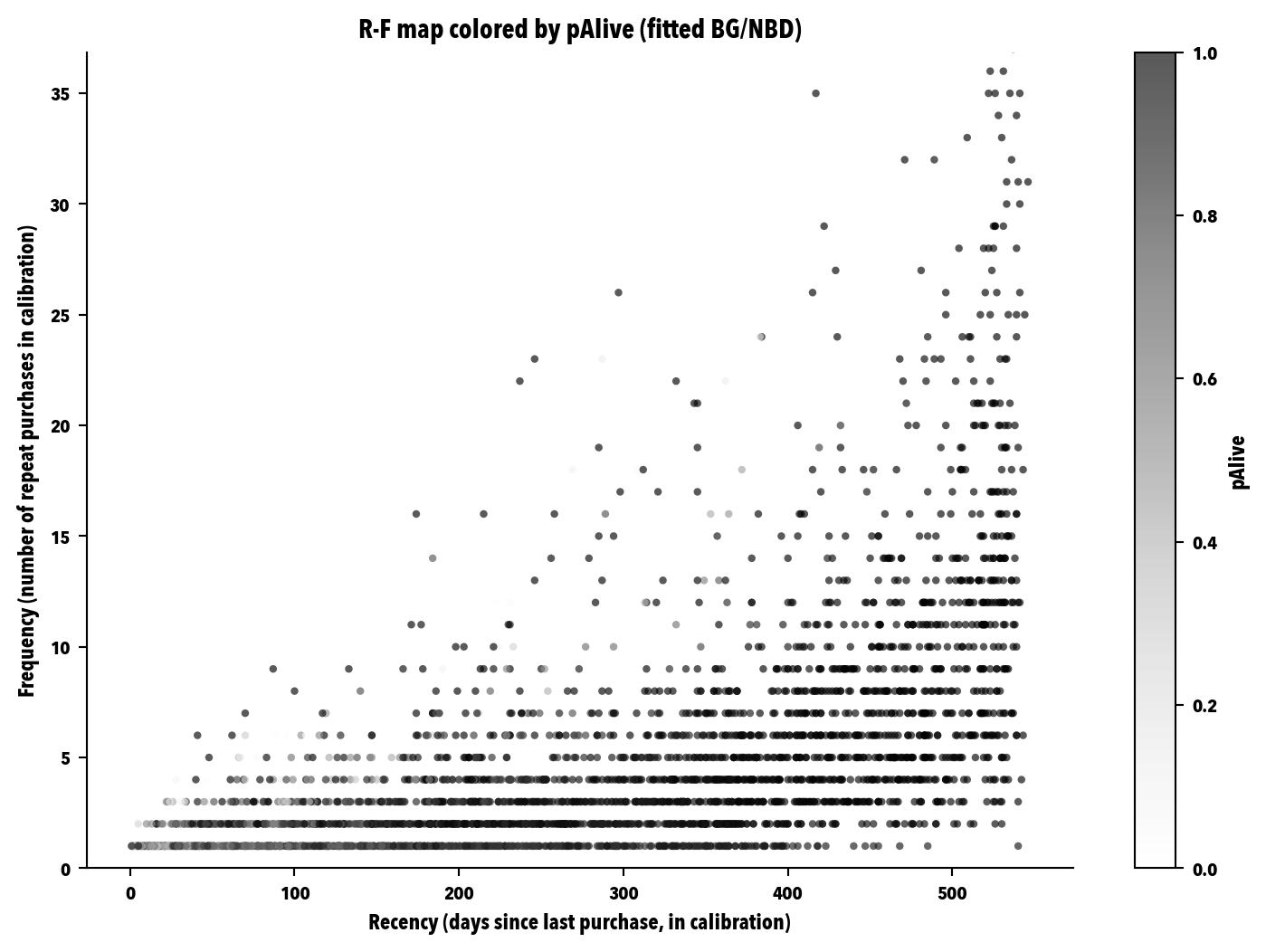
This is the same figure you saw in chapter 6 of the book (@fig-rf-map-palive-real): the map that visually shows how two customers with the same recency can have radically different pAlive depending on their historical frequency.
```{python}
#| label: fig-rf-map-palive-real
#| fig-cap: "R-F map (recency × frequency) colored by pAlive on Online Retail II. Each dot is a customer. The gray tone encodes the BG/NBD's pAlive: dark gray for high pAlive (customer with a high probability of still being active), light gray for low pAlive. The subtle diagonal you can see is the model's signature: for a given recency, high-frequency customers have a lower pAlive because their silence is more anomalous."
fig, ax = plt.subplots(figsize=(7.8, 5.6))

plot_data = predictions[predictions["frequency_cal"] > 0].copy()
sc = ax.scatter(
    plot_data["recency_cal"],
    plot_data["frequency_cal"],
    c=plot_data["pAlive"],
    cmap="Greys",
    s=10, alpha=0.65,
    vmin=0.0, vmax=1.0,
    edgecolor="none"
)
ax.set_xlabel("Recency (days since last purchase, in calibration)")
ax.set_ylabel("Frequency (number of repeat purchases in calibration)")
ax.set_title("R-F map colored by pAlive (fitted BG/NBD)")

cbar = plt.colorbar(sc, ax=ax, label="pAlive")
ax.set_ylim(0, min(plot_data["frequency_cal"].quantile(0.99), 60))
plt.tight_layout()

# This figure is the only one the book takes from the case. It's persisted here,
# inside the case's project, and "promoted" to the book via scripts/sync_figures.sh.
fig_path = Path("figures/cap06_mapa_rf_palive.svg")
fig_path.parent.mkdir(parents=True, exist_ok=True)
plt.savefig(fig_path, bbox_inches="tight")
plt.show()
```
### The "eternal Champion" revisited
In [-@sec-rfm] you empirically detected, from the maximum gap between purchases, a group of suspicious Champions. Here you cross that list with the BG/NBD model's pAlive to see whether the model independently identifies them as less alive than the rest.
```{python}
#| label: eternal-champion-model
champions_ids = rfm.loc[rfm["segment"] == "Champions", "customer_id"].astype(str).tolist()

champions_pred = predictions[predictions["customer_id"].isin(champions_ids)].copy()

print(f"Champions per RFM (retrospective segmentation): {len(champions_ids):,}")
print(f"Champions with a prediction available:          {len(champions_pred):,}")
print(f"\npAlive of the Champions:")
print(champions_pred["pAlive"].describe().round(3).to_string())

print(f"\nChampions with pAlive < 0.2 (likely 'eternal' per the model): "
      f"{(champions_pred['pAlive'] < 0.2).sum():,} "
      f"({(champions_pred['pAlive'] < 0.2).mean()*100:.1f}%)")
print(f"Champions with pAlive < 0.5: "
      f"{(champions_pred['pAlive'] < 0.5).sum():,} "
      f"({(champions_pred['pAlive'] < 0.5).mean()*100:.1f}%)")
```
A low pAlive on customers that RFM marks as Champions is exactly the footprint of an "eternal Champion": the retrospective labeling kept classifying them as best customers, but the model, conditional on frequency and age, was already saying "watch out, this one has been too quiet for their normal pattern." Ch. 7 will pick this group back up in the top-100 business exercise.
### Persisting the fourth parquet
```{python}
#| label: persist-predictions
predictions.to_parquet(OUT_DIR / "clv_predictions.parquet", index=False)

size_kb = (OUT_DIR / "clv_predictions.parquet").stat().st_size / 1024
print(f"Saved: clv_predictions.parquet ({size_kb:.1f} KB)")
print(f"Rows: {len(predictions):,}; columns: {predictions.shape[1]}")
```
## Validation: does the model predict or just fit? {#sec-validation}
Before using the model for anything, you have to put it to the test. That's the order of any defensible analysis: build, validate, and, if it passes, act. If you skip validation and go straight to action, what reaches your leadership committee is a figure with two decimals and the silent assumption that "this works." This section does exactly the opposite: it puts the fitted BG/NBD through the chapter 7 battery (four statistical validations and a top-100 business exercise, model vs RFM) before we build the value segments on the already-validated model in [-@sec-value-segments].
```{python}
#| label: setup-A10
# We reload the relevant artifacts (predictions from modeling and rfm from persistence)
# so that this validation can run independently.
predictions = pd.read_parquet(OUT_DIR / "clv_predictions.parquet")
predictions["customer_id"] = predictions["customer_id"].astype(str)

rfm = pd.read_parquet(OUT_DIR / "rfm_table.parquet")
rfm["customer_id"] = rfm["customer_id"].astype(str)

# Holdout duration (every customer has the same one because the cutoff is absolute)
dur_holdout = float(predictions["duration_holdout"].iloc[0])
print(f"Holdout duration: {dur_holdout:.0f} days ({dur_holdout/30:.1f} months approx.)")
```
### Validation 1: aggregate predictions
```{python}
#| label: val-aggregate
# The model predicts E[X(180)]; the holdout lasts ~190 days. We rescale linearly.
factor = dur_holdout / 180
predictions["exp_purchases_adjusted"] = predictions["exp_purchases_180d"] * factor

total_predicted = predictions["exp_purchases_adjusted"].sum()
total_observed = predictions["frequency_holdout"].sum()

print(f"Aggregate purchase prediction (adjusted to holdout): {total_predicted:,.0f}")
print(f"Purchases observed in the holdout:                   {total_observed:,.0f}")
print(f"Predicted / observed ratio:                          {total_predicted/max(total_observed,1):.3f}")
```
A ratio between 0.90 and 1.10 indicates the aggregate prediction is reasonably faithful. Above 1.10 the model overestimates; below 0.90 it underestimates. In any case, the aggregate is only the first rung.
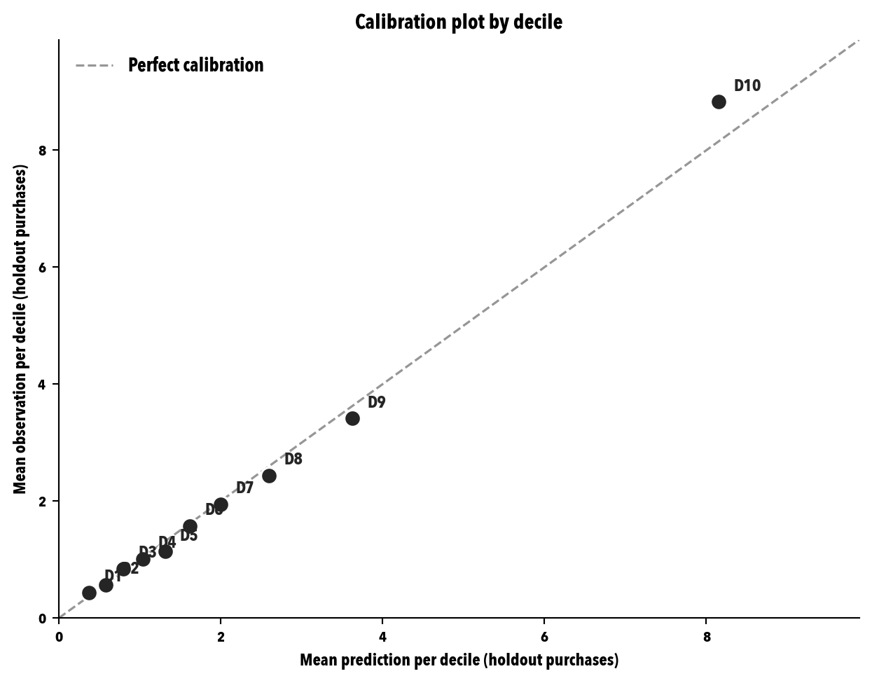
### Validation 2: *calibration plot* by decile
```{python}
#| label: fig-calibration-plot
#| fig-cap: "*Calibration plot* by decile. Each point is a BG/NBD prediction decile. The X axis is the mean prediction (adjusted to the *holdout* duration); the Y is the mean observation. The dotted diagonal is perfect calibration. Systematic deviations indicate poor calibration."
cal_data = predictions[predictions["frequency_cal"] > 0].copy()
cal_data["decile"] = pd.qcut(cal_data["exp_purchases_adjusted"], q=10, labels=False, duplicates="drop")

deciles = cal_data.groupby("decile").agg(
    mean_predicted=("exp_purchases_adjusted", "mean"),
    mean_observed=("frequency_holdout", "mean"),
    n=("customer_id", "size")
).reset_index()

fig, ax = plt.subplots(figsize=(6.6, 5.2))
max_val = max(deciles["mean_predicted"].max(), deciles["mean_observed"].max()) * 1.12
ax.plot([0, max_val], [0, max_val], "--", color="#969696", linewidth=1.2, label="Perfect calibration")
ax.scatter(deciles["mean_predicted"], deciles["mean_observed"],
           s=80, color="#252525", edgecolor="white", linewidth=1.2, zorder=3)
for _, r in deciles.iterrows():
    ax.annotate(f"D{int(r['decile'])+1}",
                xy=(r["mean_predicted"], r["mean_observed"]),
                xytext=(8, 6), textcoords="offset points",
                fontsize=9, color="#252525")
ax.set_xlabel("Mean prediction per decile (holdout purchases)")
ax.set_ylabel("Mean observation per decile (holdout purchases)")
ax.set_title("Calibration plot by decile")
ax.legend(loc="upper left", frameon=False)
ax.set_xlim(0, max_val)
ax.set_ylim(0, max_val)
plt.tight_layout()
plt.savefig(OUT_DIR / "calibration_plot.svg", bbox_inches="tight")
plt.show()
```
### Validation 3: *decile analysis*
```{python}
#| label: decile-analysis
print("Observed holdout behavior by prediction decile:")
print(deciles.round(3).to_string(index=False))

obs_sequence = deciles["mean_observed"].values
is_monotonic = all(obs_sequence[i] <= obs_sequence[i+1] for i in range(len(obs_sequence)-1))
print(f"\nIs the observed sequence by decile monotonically increasing? {is_monotonic}")
print(f"D10 / D1 ratio: {obs_sequence[-1]/max(obs_sequence[0], 0.001):.2f}x")
```
A high D10/D1 ratio (ideally >5x for good discrimination) means the model separates the valuable from the not-so-valuable well. A ratio close to 1 indicates the model is essentially noise.
### Validation 4: *lift* over the RFM *baseline*
```{python}
#| label: lift-vs-rfm
# We cross predictions with RFM. The columns are R, F, M (quintiles 1-5) and "segment".
rfm_aux = rfm[["customer_id", "R", "F", "M", "segment"]].copy()
combined = rfm_aux.merge(predictions, on="customer_id", how="inner")
combined["rfm_score_total"] = combined["R"] + combined["F"] + combined["M"]

N = 100

# Top N by model (12-month expected value) and by RFM (sum of scores)
top_model = combined.nlargest(N, "expected_value_12m")
top_rfm = combined.nlargest(N, "rfm_score_total")

# Observed holdout behavior: number of purchases
purchases_top_model = top_model["frequency_holdout"].sum()
purchases_top_rfm = top_rfm["frequency_holdout"].sum()
expected_random_purchases = combined["frequency_holdout"].mean() * N

# Observed holdout revenue
revenue_top_model = top_model["monetary_value_holdout"].fillna(0).multiply(top_model["frequency_holdout"]).sum()
revenue_top_rfm = top_rfm["monetary_value_holdout"].fillna(0).multiply(top_rfm["frequency_holdout"]).sum()

print(f"Top {N} - purchases observed in holdout:")
print(f"  Model (12m expected value): {purchases_top_model:,.0f}")
print(f"  RFM (score):   {purchases_top_rfm:,.0f}")
print(f"  Random:        {expected_random_purchases:,.0f}")
print(f"\nLift model vs random: {purchases_top_model/max(expected_random_purchases, 0.001):.2f}x")
print(f"Lift model vs RFM:    {purchases_top_model/max(purchases_top_rfm, 0.001):.2f}x")
```
### The top-100 business exercise
```{python}
#| label: top100-managerial
ids_model = set(top_model["customer_id"])
ids_rfm = set(top_rfm["customer_id"])

I = ids_model & ids_rfm  # intersection
M = ids_model - ids_rfm  # model only
R = ids_rfm - ids_model  # RFM only

print(f"=== Top {N}: consensus and dissent ===")
print(f"Intersection (I):  {len(I):3d} customers  → model + RFM consensus")
print(f"Model only (M):    {len(M):3d} customers  → model rescues, RFM didn't see")
print(f"RFM only (R):      {len(R):3d} customers  → RFM keeps, model discards")
print(f"\nOverlap rate: {len(I)/N:.1%}")
```
```{python}
#| label: dissent-analysis
df_I = combined[combined["customer_id"].isin(I)]
df_M = combined[combined["customer_id"].isin(M)]
df_R = combined[combined["customer_id"].isin(R)]

comp = pd.DataFrame({
    "Intersection (I)": df_I[["frequency_cal", "recency_cal", "pAlive", "expected_value_12m", "frequency_holdout"]].mean(),
    "Model only (M)":   df_M[["frequency_cal", "recency_cal", "pAlive", "expected_value_12m", "frequency_holdout"]].mean(),
    "RFM only (R)":      df_R[["frequency_cal", "recency_cal", "pAlive", "expected_value_12m", "frequency_holdout"]].mean()
}).round(2)

print("Mean profile of each group (calibration + observed in holdout):")
print(comp.to_string())

print(f"\nPurchases observed in holdout, by group:")
print(f"  Intersection (I): {df_I['frequency_holdout'].sum():,.0f}")
print(f"  Model only (M):   {df_M['frequency_holdout'].sum():,.0f}")
print(f"  RFM only (R):     {df_R['frequency_holdout'].sum():,.0f}")
```
### The managerial decision
Looking at the figures, three readings stand out:
- *Intersection (I).* Where model and RFM agree there's no debate. Your retention team should contact these customers without discussion. The behavior observed in the holdout usually confirms they're the most valuable.
- *Model only (M).* The ones rescued by pAlive. Look at the "recency_cal" row: they generally have higher recencies than the intersection, which knocked them out of RFM's top. The model says their historical pattern makes that silence normal and, for that reason, keeps them in the top. If in the holdout their mean behavior is close to the intersection's, the model is getting it right. If it's close to "RFM only (R)," the model is overestimating.
- *RFM only (R).* The "eternal Champions" the model discards. They bought a lot, and did so recently in RFM's eyes (because the 12-month window captures their old purchases), but their pAlive is low. If in the holdout their mean behavior is low, the model is getting it right and RFM is trapped in its retrospective character. If their mean behavior is high, there's an operational caveat to record.
Your decision, reading the table above, has three clean options:
1. **Replace RFM with the model.** If the lift is clearly >1.5x and the intersection is reasonable (50% or more), justifiable.
2. **Keep RFM and enrich it with pAlive.** For RFM's Champions, you require pAlive > threshold before contacting. It's a conservative hybrid.
3. **Keep both in parallel for a period.** The most sensible option if you're going to run a controlled A/B experiment in ch. 12.
Any of the three is defensible. What isn't: ignoring the difference. If the model has passed the four statistical validations and the business exercise without a hitch, you now have permission to use it for real: [section -@sec-value-segments] picks it up and turns it into an actionable segment table.
## Value segments: from model to decision {#sec-value-segments}
You've tied the model down well in [-@sec-validation]: the aggregate prediction checks out, the deciles order future behavior reasonably, and the lift over RFM is clear enough to take the model seriously. Now, at last, it's time to act on it. So far you have each customer's figures separately (pAlive, expected number of purchases, expected AOV, 12-month expected value), but no leadership committee wants to look at a four-thousand-row table. What they want to see, and rightly so, is a small table that answers the direct question: "how many customers do I have in each value tier, what's expected of them, and for how long?" This section builds that table.
Before writing a line of code, let me remind you of something I repeat throughout the book: any future-value figure depends on a handful of assumptions, and the difference between a defensible analysis and a made-up figure in a spreadsheet is declaring those assumptions to their face, not hiding them behind a decimal. So I put them all on the table before the first number appears.
::: {.callout-tip title="Calculation parameters, declared to their face" appearance="simple"}
- **Underlying model.** BG/NBD (frequency and dropout) + Gamma-Gamma (expected AOV), calibrated in [-@sec-predictive-modeling] over the 18 months of calibration and validated in [-@sec-validation].
- **Definition of *monetary*.** Net amount = `quantity × price`, including cancellations with their negative sign (decision 4 of [-@sec-cleaning-decisions]). No estimated margin is applied: we work with revenue, not profit.
- **Projected horizons.** 12, 24, 36, and 60 months. The 60-month one isn't a promise of tenure; it's the long horizon I use as the denominator for the "90% horizon" (below).
- **Discount rate.** Two in parallel: 1.00% monthly (≈12.68% annual, base, consistent with [-@sec-predictive-modeling]) and 0.75% monthly (≈9.38% annual, a more conservative alternative). Working with two rates isn't a show of prudence: it's the only honest way for you to see how much the rate choice weighs on the final result.
- **90% horizon.** For each customer, the smallest number of months in which the cumulative discounted value reaches 90% of the 60-month discounted value (at the base rate). It isn't the customer's residual lifetime in the theoretical sense (BG/NBD doesn't hand it over cleanly); it's an interpretable proxy for "tenure": how long the model takes to concentrate the bulk of the value it expects from that customer.
- **Grouping.** Quintiles by 12-month expected value (base rate), built over the customers with repeat frequency (>0) in calibration. Customers with a single touchpoint in calibration go to a separate group ("No repeat purchases"). An additional **Top 100** row is added with the absolute head of the ranking, which is the figure a commercial director actually uses to allocate budget.
:::
### Multi-horizon and multi-rate projection {#sec-multihorizon-projection}
I start by projecting, month by month, each customer's expected purchases out to 60 months. From that monthly purchase path, multiplied by the expected AOV and discounted at each of the two rates, I obtain the cumulative discounted value at any horizon. It's the mechanics that `lifetimes.GammaGammaFitter.customer_lifetime_value` already does internally for a fixed horizon; here I open it up underneath to have the whole path and be able to compute the 90% horizon without calling the model again.
```{python}
#| label: multihorizon-projection
# Discount rates (monthly) and horizons
BASE_RATE = 0.01      # 1.00% monthly ≈ 12.68% annual
ALT_RATE  = 0.0075    # 0.75% monthly ≈  9.38% annual
LONG_HORIZON = 60     # months
HORIZON_CUTS = [12, 24, 36, 60]

# Vectors already built by the predictive modeling section
F = cal_hold["frequency_cal"].values
R = cal_hold["recency_cal"].values
T = cal_hold["T_cal"].values
M = cal_hold["monetary_value_cal"].values

# Expected AOV per customer: Gamma-Gamma for freq>0, population mean for freq=0
pop_aov = float(gg_check["monetary_value_cal"].mean())
exp_aov = np.full(len(F), pop_aov, dtype=float)
mask_pos = F > 0
exp_aov[mask_pos] = np.asarray(
    ggf.conditional_expected_average_profit(F[mask_pos], M[mask_pos])
)

# Cumulative purchases through the end of each month (vectorized per customer)
cum_purchases = np.zeros((LONG_HORIZON + 1, len(F)))
for month in range(1, LONG_HORIZON + 1):
    t_days = month * 30  # 30-days/month convention (the same one lifetimes uses)
    out = bgf.conditional_expected_number_of_purchases_up_to_time(t_days, F, R, T)
    cum_purchases[month] = np.asarray(out)

monthly_purchases = np.diff(cum_purchases, axis=0)  # shape (60, n)


def discount(monthly_purchases: np.ndarray, aov: np.ndarray, rate: float):
    """Return monthly and cumulative discounted value given a monthly rate."""
    discount_factor = (1 + rate) ** np.arange(1, monthly_purchases.shape[0] + 1)
    monthly_value = monthly_purchases * aov / discount_factor[:, None]
    return monthly_value, np.cumsum(monthly_value, axis=0)


monthly_value_base, cum_value_base = discount(monthly_purchases, exp_aov, BASE_RATE)
monthly_value_alt,  cum_value_alt  = discount(monthly_purchases, exp_aov, ALT_RATE)

# Output DataFrame, one row per customer
seg = pd.DataFrame({"customer_id": cal_hold.index.astype(str)})
seg["pAlive"]        = np.asarray(palive)
seg["frequency_cal"] = F
seg["recency_cal"]   = R
seg["T_cal"]         = T
seg["expected_aov"]  = exp_aov

for h in HORIZON_CUTS:
    seg[f"purchases_{h}m"]  = cum_purchases[h]
    seg[f"value_{h}m_r100"] = cum_value_base[h - 1]
    seg[f"value_{h}m_r075"] = cum_value_alt[h - 1]

# 90% horizon of the 60-month value (base rate)
val_60_base = cum_value_base[-1]
threshold = val_60_base * 0.90
mask_val_pos = val_60_base > 0
exceeded = cum_value_base >= threshold[None, :]
threshold_month = np.where(mask_val_pos, np.argmax(exceeded, axis=0) + 1, -1)
seg["horizon_90pct"] = threshold_month

print(seg[[
    "pAlive", "frequency_cal", "expected_aov",
    "value_12m_r100", "value_60m_r100", "horizon_90pct"
]].describe().round(2).to_string())
```
### Segment assignment: quintiles + top 100
The quintiles are built over the 12-month expected value (base rate) among customers with frequency >0 in calibration. The rest (those who appear only once in the period) go to their own tier: the model still assigns them an expected value, but their managerial reading is different and it's best not to dilute them into the quintiles.
```{python}
#| label: segment-assignment
mask_calib = seg["frequency_cal"] > 0

# Quintiles over customers with repeat frequency
seg["quintile"] = "No repeat purchases"
labels = ["Q1 (lowest)", "Q2", "Q3", "Q4", "Q5 (highest)"]
quintiles = pd.qcut(
    seg.loc[mask_calib, "value_12m_r100"].rank(method="first"),
    5,
    labels=labels
).astype(str)
seg.loc[mask_calib, "quintile"] = quintiles.values

# Absolute top 100 over the 12m base value (may overlap with Q5)
top100_ids = seg.nlargest(100, "value_12m_r100")["customer_id"].tolist()
seg["top100"] = seg["customer_id"].isin(top100_ids)

print("Distribution by segment:")
print(seg["quintile"].value_counts().reindex(["No repeat purchases"] + labels))
print(f"\nCustomers in absolute Top 100: {seg['top100'].sum()}")
```
### Summary table by segment {#sec-segment-table}
This is the table a leadership committee wants to see at a glance. One row per tier (the five quintiles, the "no repeat purchases" customers, the *Top 100* row, and the total) and, in columns, the metrics that really matter: group size, mean pAlive, expected AOV, 12- and 60-month expected value, the group's weight in the total 60-month value, and the median 90% horizon.
```{python}
#| label: value-segment-table
total_value_60m = seg["value_60m_r100"].sum()


def summarize(group: pd.DataFrame) -> pd.Series:
    horiz = group.loc[group["horizon_90pct"] > 0, "horizon_90pct"]
    return pd.Series({
        "n_customers":       len(group),
        "pct_customers":     len(group) / len(seg) * 100,
        "pAlive_mean":       group["pAlive"].mean(),
        "avg_aov":           group["expected_aov"].mean(),
        "value_12m_mean":    group["value_12m_r100"].mean(),
        "value_36m_mean":    group["value_36m_r100"].mean(),
        "value_60m_mean":    group["value_60m_r100"].mean(),
        "value_60m_total":   group["value_60m_r100"].sum(),
        "pct_value_60m":     group["value_60m_r100"].sum() / total_value_60m * 100,
        "horizon_90pct_med": horiz.median() if len(horiz) else np.nan,
    })


order = ["No repeat purchases"] + labels
quintile_table = (seg.groupby("quintile", observed=True)
                     .apply(lambda g: summarize(g))
                     .reindex(order))
row_top100 = summarize(seg[seg["top100"]]).to_frame("Top 100").T
row_total  = summarize(seg).to_frame("Total").T

summary_table = pd.concat([quintile_table, row_top100, row_total])

formatters = {
    "n_customers":       "{:>6,.0f}".format,
    "pct_customers":     "{:>5.1f}%".format,
    "pAlive_mean":       "{:>5.2f}".format,
    "avg_aov":           "{:>8,.2f}".format,
    "value_12m_mean":    "{:>9,.2f}".format,
    "value_36m_mean":    "{:>9,.2f}".format,
    "value_60m_mean":    "{:>9,.2f}".format,
    "value_60m_total":   "{:>11,.0f}".format,
    "pct_value_60m":     "{:>5.1f}%".format,
    "horizon_90pct_med": "{:>5.0f}".format,
}
print(summary_table.to_string(formatters=formatters))
```
Read the table slowly. Three readings are worth the time:
First, the **concentration**. Quintile 5 takes, in a typical noncontractual base like this one, a fraction of the total 60-month value wildly out of proportion to its 20% of customers. The *Top 100* row (around 2-3% of the repeat-frequency customers) usually concentrates between 15% and 30% of the total value. It's the same asymmetry you already saw in [-@sec-rfm] with RFM's Champions segment, now measured in forward-looking expected value rather than history. It's not a defect: it's the structure of any customer base and the reason why paying the same to acquire anyone is a terrible idea.
Second, each quintile's mean pAlive. In general (and this is what you'll see) the high quintiles have high pAlive and the low ones don't. This is partly tautological, because the model builds the expected value precisely from pAlive and frequency. But if you find a quintile with a surprisingly low pAlive for its expected value (say, someone with an enormous AOV but few purchases and recent silence), you have a red flag: the expected value rests on a fragile assumption and it's worth looking customer by customer.
Third, the **90% horizon**. It's the cleanest answer the model can give you to the question "for how long am I going to monetize this customer?" A short horizon (12-18 months) means the bulk of the value materializes fast and that the risk of changes in future behavior is low (because you barely expect any future behavior anymore). A long horizon (40-60 months) means the value is spread more over time and, therefore, is more sensitive to the discount rate, to changes in the purchase pattern, and to the model's own long-term stability. For your retention team, a Q5 with a short horizon is a priority, low-risk target; a Q5 with a long horizon, also a priority, but you'll want to review the forecast more often.
### Sensitivity to the discount rate {#sec-discount-rate-sensitivity}
Lowering the discount rate increases the value at long horizons, because distant flows weigh more. The practical question is by how much. I look at it here in parallel, segment by segment.
```{python}
#| label: rate-sensitivity
rate_summary = (seg.groupby("quintile")
                   .agg(value_12m_r100=("value_12m_r100", "mean"),
                        value_60m_r100=("value_60m_r100", "mean"),
                        value_12m_r075=("value_12m_r075", "mean"),
                        value_60m_r075=("value_60m_r075", "mean"))
                   .reindex(order))
rate_summary["delta_60m_pct"] = (
    (rate_summary["value_60m_r075"] - rate_summary["value_60m_r100"])
    / rate_summary["value_60m_r100"].replace(0, np.nan) * 100
)

print(rate_summary.round(2).to_string())
```
The effect of moving the rate from 1% to 0.75% monthly will be larger in the high quintiles and, above all, in the customers with a long 90% horizon, because they're the ones with the most distant value to discount. If any row shows you a variation above 15% when moving the rate by a few basis points, you're not looking at a "good estimate with two possible rates" but at a figure that rests too much on the financial assumption. The practical takeaway: if you're going to use this number to defend a business case, declare the rate before the figure.
### Persisting the new artifact
```{python}
#| label: persist-segments
seg.to_parquet(OUT_DIR / "value_segments.parquet", index=False)

size_kb = (OUT_DIR / "value_segments.parquet").stat().st_size / 1024
print(f"Saved: value_segments.parquet ({size_kb:.1f} KB)")
print(f"Rows: {len(seg):,}; columns: {seg.shape[1]}")
```
### From calibrated customers to new ones: how to act on the analysis {#sec-new-customers}
So far the model tells you what to expect from the customers you **already know**: each row of `value_segments.parquet` carries its pAlive, its 12-month value, and its quintile. But marketing decisions rarely stop at the stock of the current base: you also have to weigh in on the customer who'll arrive next month and, above all, on how much you can pay to acquire them. I close the segments section by showing you how to act on the analysis for new customers, using as a textbook example the customers who appeared for the first time after the calibration cutoff (an example chosen on purpose because, remember decision 5 of [-@sec-calibration-cutoff], those customers were deliberately left out of the model).
```{python}
#| label: new-customers-unconditional
# 1) The concrete gap: customers with a first purchase after the cutoff
first_purchases = trans_pos.groupby("customer_id")["invoice_date"].min()
post_cutoff = first_purchases[first_purchases > cal_cutoff_date]
n_post = len(post_cutoff)
n_total = trans_pos["customer_id"].nunique()

print(f"Calibration cutoff: {cal_cutoff_date.date()}")
print(f"Customers with 1st purchase BEFORE the cutoff (in seg): {len(seg):>5,}")
print(f"Customers with 1st purchase AFTER the cutoff:           {n_post:>5,}  "
      f"({n_post/n_total*100:.1f}% of total with positive purchases)")
print("The latter have no individual pAlive or expected value: the model didn't see them.")

# 2) Unconditional figure: what the model expects from a "newborn" customer
cum_purchases_new = np.zeros(LONG_HORIZON + 1)
for month in range(1, LONG_HORIZON + 1):
    t_days = month * 30
    cum_purchases_new[month] = float(bgf.expected_number_of_purchases_up_to_time(t_days))

monthly_purchases_new = np.diff(cum_purchases_new)
base_discount = (1 + BASE_RATE) ** np.arange(1, LONG_HORIZON + 1)
monthly_value_new = monthly_purchases_new * pop_aov / base_discount
cum_value_new = np.cumsum(monthly_value_new)

print(f"\nExpected value of an AVERAGE NEW CUSTOMER (base rate = {BASE_RATE*100:.2f}%/month):")
print(f"  Excludes the first order by BG/NBD convention; add {pop_aov:,.2f} if you need it included.")
for h in HORIZON_CUTS:
    print(f"  {h:>2d} m: {cum_value_new[h-1]:>9,.2f}")

# 3) References to place the magnitude
val_12m_q3     = seg.loc[seg["quintile"] == "Q3", "value_12m_r100"].mean()
val_12m_top100 = seg.loc[seg["top100"], "value_12m_r100"].mean()

print(f"\nReferences to place the figure (at 12 months):")
print(f"  Average new customer:                 {cum_value_new[11]:>9,.2f}")
print(f"  Q3 mean (middle of the base):          {val_12m_q3:>9,.2f}")
print(f"  Top 100 mean (head of the ranking):    {val_12m_top100:>9,.2f}")
```
The figure that appears above (the expected value of an average new customer) isn't magic or a new assumption: it's the flip side of the same model you already calibrated. BG/NBD, besides the conditional answer "given this F, R, T, what do I expect from this customer?", delivers the unconditional answer "what do I expect from any given customer this base produces?" The first answers decisions about individual customers (whom do I contact from the current stock); the second, decisions about the base as such (how much can I pay to bring in more customers like the ones I already have).
There are three ways to act on this calculation operationally, ordered from least to most sophisticated, and each serves a different kind of decision:
1. **Unconditional figure as a planning benchmark.** It's what you just obtained. It's the figure you need to defend or destroy an acquisition business case: if a campaign brings you customers at an acquisition cost (CAC) above the expected value of an average new customer, you're destroying value in aggregate, however much some individual customers end up being *Champions*. The 12-month figure fits the usual budgeting horizon; the 60-month one (higher, but also more sensitive to the discount rate, as [-@sec-discount-rate-sensitivity] already reminded you) is more comfortable for strategic discussions and for pricing loyalty programs.
2. **Proxy assignment at first contact.** If at the moment of acquisition you have some observable information (source channel, country, first-purchase category, first order's value), you can go beyond the aggregate: you assign the new customer to the [-@sec-segment-table] segment they most resemble. For this to work you need prior evidence that those variables observable at the start correlate with the final segment. In retail that evidence usually exists (customers with a high first order tend, on average, toward high quintiles), but it's worth checking in your data before trusting it: a weak correlation with the proxy leads you, once again, to stick with the unconditional figure and move on.
3. **Continuous refresh as history arrives.** With the first, second, and third purchase, the customer accumulates their F, R, T, and BG/NBD moves, by construction, from the unconditional figure to an increasingly sharp individualized one. Operationally, this translates into a simple workflow: you recalibrate the model every N months (3, 6, or 12 depending on volume), reassign predictions to all customers (the new ones move from the unconditional figure to the conditional one once they have enough history for the computation to be stable), and rewrite `clv_predictions.parquet` and `value_segments.parquet`. Your CRM reads those tables and acts.
One caveat about the first order. BG/NBD models **repeat** purchases by convention: the first order doesn't enter `E[X(t)]`. If you need the total acquisition value (because the CAC is paid to acquire that first purchase), add to the unconditional figure the `pop_aov` you computed in [-@sec-multihorizon-projection]. The omission of the first order is a model convention, not a calculation oversight, and it's worth keeping in mind when the figure goes into a marketing finance spreadsheet.
### Updating `CARD.md` with all the artifacts
```{python}
#| label: card-final
card_extra = f"""

## Additional artifacts (modeling, validation, and segmentation)

- `clv_predictions.parquet`: one row per customer with calibration frequency/recency/T, pAlive, expected number of purchases at 180 days, expected AOV, and forward-looking expected value at 12 months (generated in the predictive modeling).
- `calibration_plot.svg`: decile calibration plot generated in the validation.
- `value_segments.parquet`: one row per customer with value quintile, projections at 12, 24, 36, and 60 months, two discount rates in parallel, and 90% horizon of the 60-month value (generated in the value segments).

## Predictive modeling decisions

5. **Calibration / holdout cutoff:** 2011-06-01 (18 months of calibration, ~190 days of holdout).
6. **Cancellations in the fit:** excluded (models assume a nonnegative count process).
7. **Main model:** BG/NBD + Gamma-Gamma (noncontractual, reasonable frequency, stable behavior).

## Aggregate figures of the fit and validation

- Customers in calibration/holdout summary: {len(predictions):,}
- BG/NBD parameters: r={bgf.params_['r']:.3f}, alpha={bgf.params_['alpha']:.3f}, a={bgf.params_['a']:.3f}, b={bgf.params_['b']:.3f}
- Gamma-Gamma parameters: p={ggf.params_['p']:.3f}, q={ggf.params_['q']:.3f}, v={ggf.params_['v']:.3f}
- Predicted/observed ratio (aggregate validation): {total_predicted/max(total_observed,1):.3f}
- Lift model vs RFM (top 100): {purchases_top_model/max(purchases_top_rfm, 0.001):.2f}x
- Top 100 intersection model vs RFM: {len(I)}/{N} ({len(I)/N:.0%})
"""

with open(OUT_DIR / "CARD.md", "a", encoding="utf-8") as f:
    f.write(card_extra)

print("CARD.md updated with the modeling, validation, and segmentation block.")
```
## So now what?
You've closed the case study end to end: audit, cleaning, cohorts, RFM, calibration of BG/NBD and Gamma-Gamma, generation of pAlive and per-customer expected value, model validation via four statistical routes and a top-100 business exercise, and actionable segmentation by value quintiles with two discount rates in parallel. Build, validate, act, in that order and without skipping any of the three. That is, literally, what a serious CLV project would ask for in any organization.
The five artifacts persisted in `materials/ch05/outputs/` (the three initial tables, `clv_predictions.parquet`, and `value_segments.parquet`) are the base of the following chapters:
- *Ch. 8 (value-based segmentation).* Will use `value_segments.parquet` as the main input and compare segmentation based on pAlive + forward-looking expected value against the canonical RFM one.
- *Ch. 10 (retention decisions).* Will use pAlive, the 12-month expected value, and the 90% horizon to prioritize the retention budget.
- *Ch. 12 (the model-decision gap).* Will put a name, in organizational terms, to the problem you've already seen appear here: the top-100 business exercise isn't just a statistical diagnosis, it's a fight over the decision.
If you reach ch. 8 with the feeling of "*I've already got the data; now tell me how it translates into action*," you're headed in the right direction. And if you've been left with the opposite feeling of "*this predictive-modeling stuff is a world I still need to chew on more*," that's fine too: go back, rerun the case with other decisions (a different window, a different temporal cutoff, without filtering cancellations, whatever) and watch how the numbers change. **Decide, document the decision, and leave a defensible trail** isn't just a slogan: it's the only way I know to learn to make modeling decisions with judgment.